The Problem:
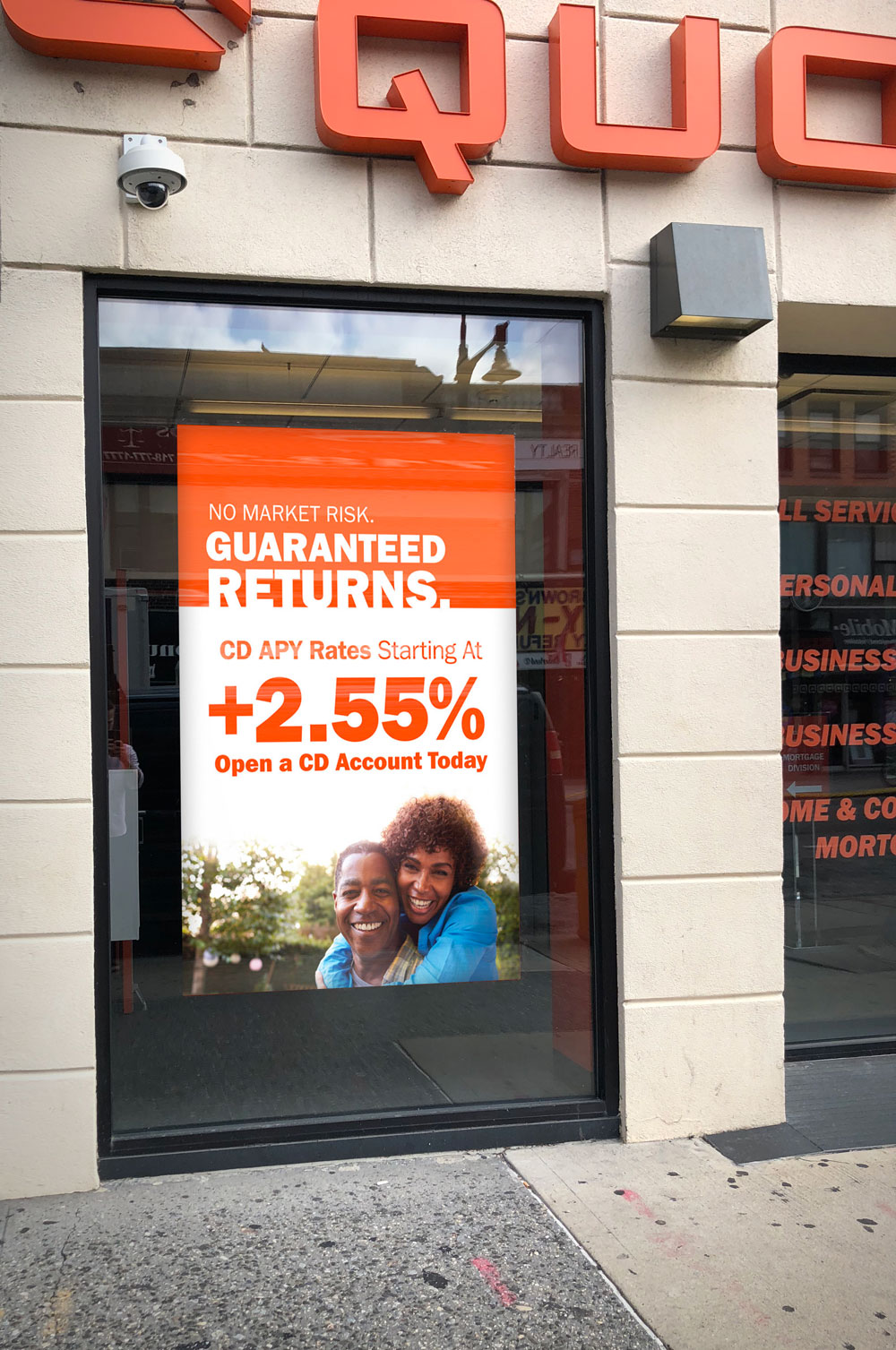
Quontic Bank needed a large format poster to advertise their new banking product. This poster needed to be big enough to read across the busy New York City street where it would be installed.
The Solution:
Focusing the design around minimal usage text and photography targeted at a key demographic, the designs were large enough to be visible from across the street while only communicating key information most likely to get a potential client to inquire further.
You might also like…
Promotional Posters
